SVG Module: Rounded Corners
In this document we show an example how to use the SVG module to create rounded corners in a convenient way.
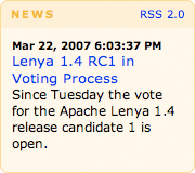
The following screenshot shows a typical box with rounded corners:

We want to allow dynamic scaling of the box in all directions. That's why we have to use four separate images for the rounded corners. The images shall be referenced from a CSS.
HTML
The HTML of this box looks like this:
<div id="news">
  <div id="newsOuter">
    <div id="newsInner">
      <div class="rsslink">
        <a href="/news.rss" type="application/rss+xml">RSS 2.0</a>
      </div>
      <h1>News</h1>
      <h2>
        <div class="newsDate">Mar 22, 2007 6:03:37 PM</div>
        <a style="text-decoration: none" href="/news/lenyaRCvote.html"
          >Lenya 2.0 RC1 in Voting Process</a>
      </h2>
      <p>Since Tuesday the vote for the Apache Lenya 2.0 release candidate 1 is open.</p>
    </div>
  </div>
</div>
We use four HTML containers to hold our corner images. Each left corner image is quite wide (1500 pixels) to allow very large boxes. The right corner version is only as wide as the radius of the corner. That's why the right corner image has to be placed on top of the left corner image, i.e. the right corner container has to be inside the left corner container.
-
The
<div id="news"/>will hold the top left corner. -
The
<h1/>will hold the top right corner. -
The
<div id="newsOuter"/>will hold the bottom left corner. -
The
<div id="newsInner"/>will hold the bottom right corner.
To fill the space between the upper and lower corners, we will add a background
color and a border to our <h2/> and <p/>
elements which are located inside the box.
Calling the SVG Module
This is the anatomy of a call to a rounded corner image:
/modules/svg/tab-{location}-{radius}-{background}-{border}.png
An example:
/modules/svg/tab-bottomLeft-7-FFF6E5-FFD580.png
-
/modules/svg/calls the SVG module. -
-tab-denotes that we want to generate a rounded corner image (which is typically used for tabs). -
-bottomLeft-means that we want to generate the bottom left corner. -
-7-means that we want a corner radius of 7 pixels. -
-FFF6E5-is the background color. -
-FFD580is the border color. You can of course use the same color values for background and border.
CSS
This is the important part of the CSS used for the box layout (fonts, colors etc. have been omitted):
div.newsDate {
  float: right;
}


div#news {
  width: 180px;
  margin: 0 0 0 20px;
  background: url('/modules/svg/tab-topLeft-7-FFEECC-FFD580.png') left top no-repeat;
}

div#news h1 {
  margin: 0;
  padding: 7px 10px;
  background: url('/modules/svg/tab-topRight-7-FFEECC-FFD580.png') right top no-repeat;
}

div#news div.newsDate {
  padding-top: 10px;
}

div#newsOuter {
  background: url('/modules/svg/tab-bottomLeft-7-FFF6E5-FFD580.png') left bottom no-repeat;
}

div#newsInner {
  background: url('/modules/svg/tab-bottomRight-7-FFF6E5-FFD580.png') right bottom no-repeat;
  padding-bottom: 10px;
}

div#news h2 {
  padding: 0px 5px 0 5px;
}

div#news p {
  padding-bottom: 10px;
}

div#news p, div#news h2 {
  margin: 0;
  padding-left: 10px;
  padding-right: 10px;
  border-left: 1px solid #FFD580;
  border-right: 1px solid #FFD580;
  background-color: #FFF6E5;
}

div.rsslink {
  float: right;
  padding: 7px 10px;
}


